

Project Overview
This project showcases my first designs for millennial women from discovery to design.
Duration
Aug 2021 (8 weeks)
Tag
Product design, User research, User interview, Mobile app design, E-Commerce, Branding, Usability testing
Tools
InVision, Miro, Photoshop, Figma
Team
Teng Wong, Pauline Thach, Chenghua Wen
Kickoff
In a design class at UCSD, the professor assigned us to design a product feed for 34-38-year-old female customers. So, I asked myself what a millennial would look like. What do they care about the most in their late 30s? What are their habit and lifestyle?


SHE-COMMERCE
Recent trend
1.
Diverse Shopping Interests and Niche Markets
2.
Seeking Novel Experiences and Challenges for Brand Loyalty
3.
Higher Expectations in Shopping Experience


E-COMMERCE HABITS
Western VS Eastern
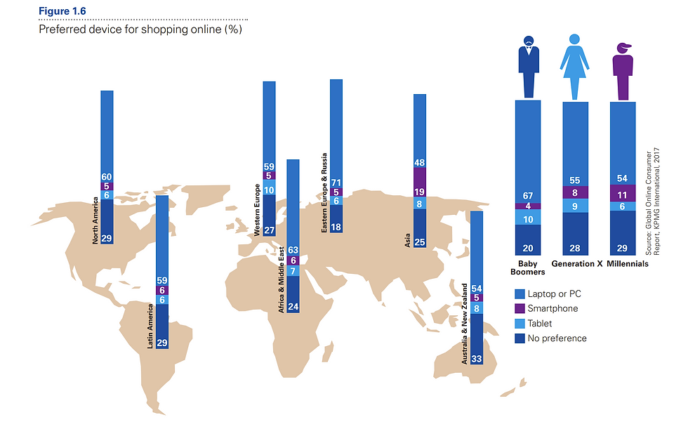
According to a 2017 Global Online Consumer report:
Western women:
-
Price > Brand Reputation
-
Prefers laptop
Eastern women:
-
Brand reputation > Price
-
Prefer smartphone
QUALITATIVE DATA ANALYSIS
Video-Based Survey Analysis on Information Feeds
I conducted qualitative data analysis on a large-scale video-based dataset on information feeds (social media) collected in early 2021 from the company Mindswarms.com.
I encoded 6 respondents in my target age-gender group and compared that with 4 respondents in an opposite-gender group.
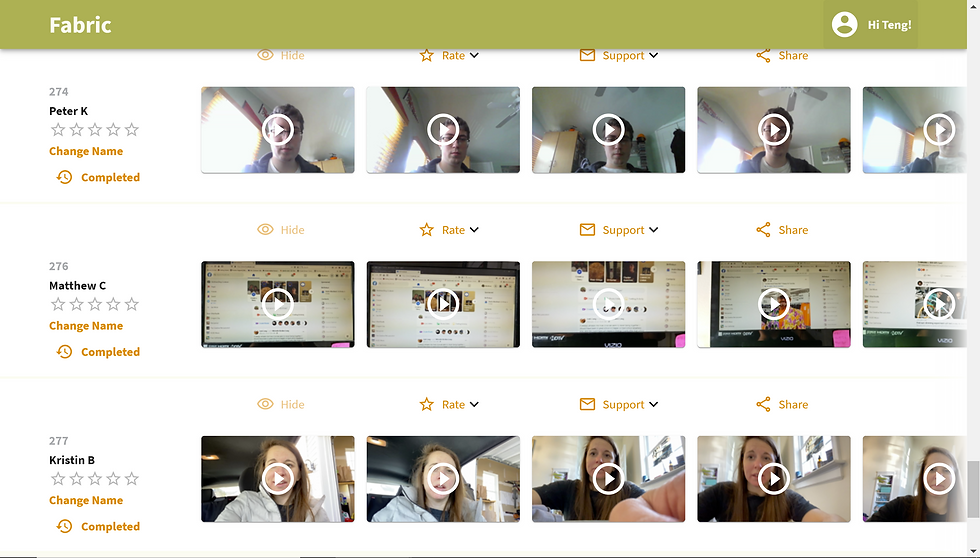
Thanks to a partnership with the company Mindswarms.com, we will have access to a large-scale video-based dataset on information feeds collected in early 2021.

Female perspective

Male perspective
Thanks to a partnership with the company Mindswarms.com, we will have access to a large-scale video-based dataset on information feeds collected in early 2021.
Female customers care about...
-
Content Shareability
-
Have a detailed profile
-
Rich content and info
-
The difference between the mobile version and the PC version
Male customers care about...
-
social media influenced
-
care about share functions
-
consumption & escapism
-
willing to try new services
-
Rely on feeds and recommendations
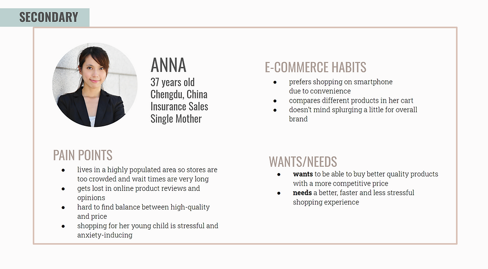
Meet the User
.png)
.png)
STORYBOARD INTERVIEWS
9 Insights from 3 Interviews
She said
→ Price Sensitivity and Discounts
→ Shopping for Others
→ Discovering New Brands via Advertising
→ Seeking the Best Deal
→ Preference for Desktop Shopping
→ Dislike for Repetitive Ads
→ Importance of Product Videos
→ Comparing Items in Cart
→ Valuing Advertisements for Recommendations
.png)
.png)

Price, discounts, and buying for others are priorities in shopping. Advertisements are useful, but repetition is annoying. Consumers compare and seek cheaper options on mobile, but prefer desktop shopping. Explanation videos are valued.
Mission Statement
To improve the mobile shopping experience by providing a platform that fosters genuine and authentic research and reviews in a community setting for a more enjoyable and stress-free experience.
Key Challenges
Currently, popular ‘Western’ discount referral apps can not satisfy the average female customer’s shopping experience.
-
Can’t do extensive research on mobile apps.
-
Hard time extinguishing between authentic and faked reviews.
-
Less trustful of companies, more trust in peers’ opinions and reviews.
-
Hard time comparing product features.
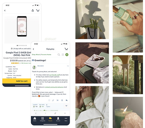
Competitive Analysis
.png)
Wireframes
Before moving on to high-fidelity wireframes and mocks, we wanted to get a feel for what the core of the app would look like when put in front of me.
 Product display page |  Q&A/Comment page |  Collection page |
|---|---|---|
 Product recommendation page |  Buyer Review |  Q&A Platform |
 Sharing game |  Digital Wallet |  Homepage |
 Homepage |
Low-fidelity Prototypes
We create a low-fidelity prototype that builds on my sketches and wireframes, which would allow someone to try out the key functions of the app.


Moodboard
We drew inspiration from our user research and personas and created a list of adjectives that capture the essence of the emotional experience we want to create with our design ideas.
User Testing & Iteration
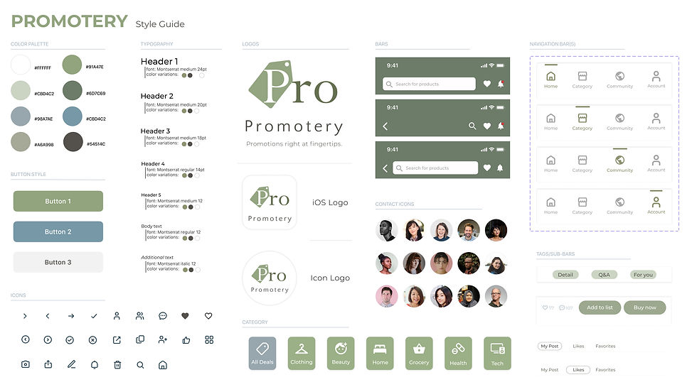
Logo Design & Style Guide
We named it Promotery since this app is collecting promotions for people. Then, based on the moodboard select colors, typefaces, and design elements for a style guide.
Information Feed

Landing Page
Collection List

Community Section

Sharing Function

After User Testing
User Testing & Iteration 1
The edit function on the Collect page is confusing people. Since "create list" "share list" and "delete" are all select actions, I replace edit to select.


User Testing & Iteration 2
The compare product button on the Compare page is not obvious enough to catch people's attention.
Therefore, I move the compare button from the bottom to the top, so that is making sure it is what people first see.
User Testing & Iteration 3
I Changed the feed card to a light color to leave attention to the content and used a simple design for group buttons to reduce confusion since beige is also a key color for Q&A posts.
For friend selection, improving the selection list design can reduce confusion and better follow the overall simplistic and light design style.
